Feature Redesign:
Monitoring Dashboard
Enhancing data visualization to help bioinformaticians track
surface workflow activity, failures, and trends at a glance
⬆ 30% Active Users
⬆ 4x Feature Adoption
Context
DNAstack: a cloud-based company, that aims at advancing precision medicine through secure data sharing and analysis
Workbench: a product enables bioinformaticians to analyze multi-omics data, build workflows, and collaborate across teams in a secure cloud environment
Problem
Low Adoption & Retention: The product had difficulty gaining traction, with limited user onboarding and low retention rates
Poor Usability: Users reported a frustrating experience on smaller screens (13-inch laptop display)
Role
Product Designer: User Interview, Heuristic Analysis, Competitive Analysis, Data Visualization, Wireframes, A/B Testing, Hi-Fi Design, Animation, Interactive Prototype, Developer Handoff
Collaborated in a cross-functional team of 8
Solution
In two design sprints (one month), I led a comprehensive interface redesign:
✦ Launched new features to address user needs (⬆ 30% Active Users)
✦ Elevated visual design to boost engagement (⬆ 4x Feature Adoption)
✦ Improved usability for smaller screens
Emphasize
User Interview
I conducted interviews with 5 bioinformaticians (our primary users) from partner institutions, as well as members of our internal data team, to understand what was stopping users from choosing our product and where their needs were not being met.
Key Insights:
• Users needed a clear overview of workflow health
• Visual indicators (e.g., color, icons, graphs) were strongly preferred over dense tables
• Users found it difficult to locate specific runs and requested a more intuitive functionality such as filtering, sorting, and search
Heuristic Analysis
In response to user feedback about poor usability, I used Jakob Nielsen’s 10 Usability Heuristics as a framework to identify specific UI issues that might be causing friction.
Key Insights:
• Filter overflow issues on smaller screens
• Fixed-width cells cut off long text, forcing users to hover over each cell to read full content
• Failed runs were not clearly surfaced, and users had to dig into logs to find out
• An “Actions” column repeated in every row, adding visual noise without value
Competitive Analysis
To gather inspiration and identify best practices, I analyzed 3 leading platforms (Datadog, Tableau and Kaggle) with similar use cases in data monitoring and workflow tracking.
Findings:
• They use dashboards as the primary surface for displaying key metrics and trends
• Allow users to drill down into specific data points, filter results, or customize views based on context
• Rely on visual indicators — such as charts, color-coded badges, and icons—to highlight status, trends, and anomalies
Define
User Survey
After presenting my findings and initial dashboard concept during our weekly design meeting, the idea received strong support from both the product and engineering teams. Then I quickly created and distributed a short survey to our primary users, asked which metrics they would find most valuable in a high-level dashboard overview.
Results:
• Run Statuses - 100%
• Most Executed Workflows - 87%
• Workflow Runtime - 76%
• Top Executed Engines - 74%
Based on the survey results, we prioritized the top four most requested data points for the first release, and planned to expand and refine the dashboard in future iterations based on user feedback.
Data Visualization
Next, I conducted focused research on data visualization best practices to ensure that each data point was communicated clearly and effectively.
Results:
• Donut Chart - shows proportions effectively, and allows for multiple statistics to be displayed within the same chart
• Pie Chart - effectively displays proportions for a small number of categories
• Bar Chart - allows for clear and side-by-side comparison
Ideate
Wireframes
To explore different layout ideas, I began by sketching low-fidelity wireframes that mapped out how summary statistics and run logs could be displayed more effectively. I then conducted quick A/B testing sessions with users to compare variations and gather feedback on their preferences.
Feedbacks:
• 85% users found Design 1 to be more visually appealing
• A majority of users expressed a strong need to view the full legend at all times
Based on the user feedback, I brainstormed creative ways to iterate my design. To optimize space and avoid clutter, I introduced a toggle switch that allows users to show or hide the metrics for each chart.
Color Palette
I used an online visualization tool to generate a 10-color palette, then carefully refined it to achieve a balanced, visually appealing look that remains distinguishable across different user types. To ensure accessibility, I conducted thorough testing to confirm the palette met WCAG contrast standards and was usable by individuals with color vision deficiencies.
Prototype
Dashboard
Using Chart.js animations, the dashboard display a smooth intro animation each time they load, enhancing the overall visual appeal. Hovering over the chart triggers contextual tooltips, providing detailed information for each color-coded data point.
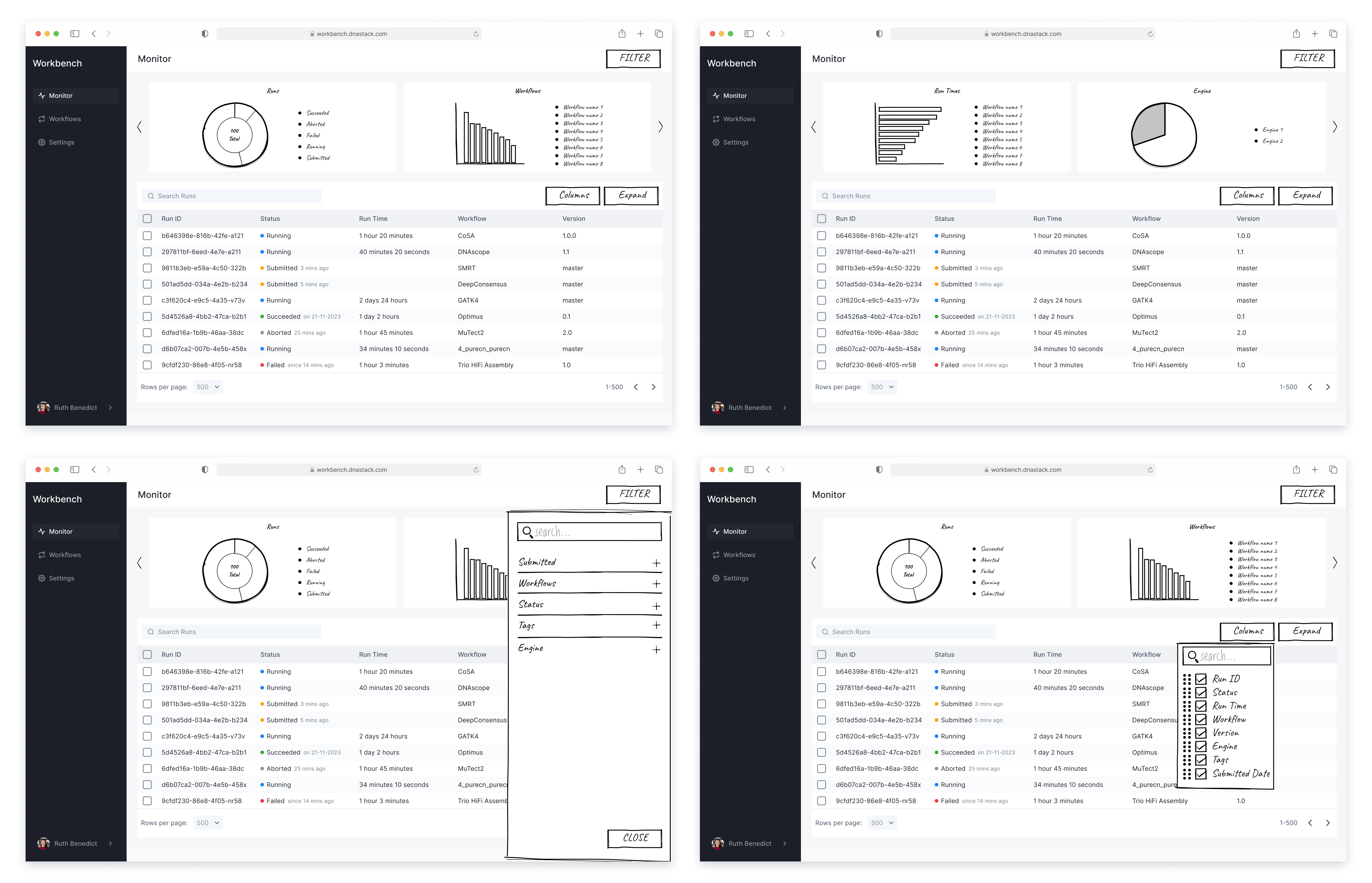
Filter Sidebar
To address the overflow issue on smaller screens, I moved all filter buttons into a collapsible sidebar, allowing users to easily open, apply filters, and narrow down results without cluttering the main interface.
Column Editor
I also introduced a column editor that allows users to fully customize their table view—enabling them to select, deselect, and reorder columns, as well as choose to wrap or clip text, so they can tailor the table to their preferred way of viewing data.
Developer Handoff
Since dashboards were a new component in our product, I provided detailed interaction guidelines to ensure smooth implementation. After researching chart animations, I selected an intro animation using Chart.js and shared clear specifications with developers. My handoff included thorough documentation to minimize ambiguity, while staying available for discussions to support the build process.

.svg)


.png)